NAVIGATION
JONY IVE
We shouldn’t be afraid to fail- if we are not failing we are not pushing. 80% of the stuff in the studio is not going to work. If something is not good enough, stop doing it.

Thermomix Packaging
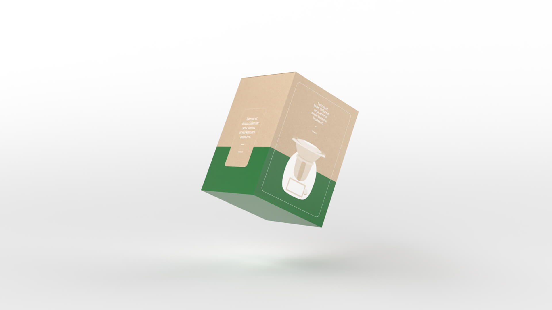
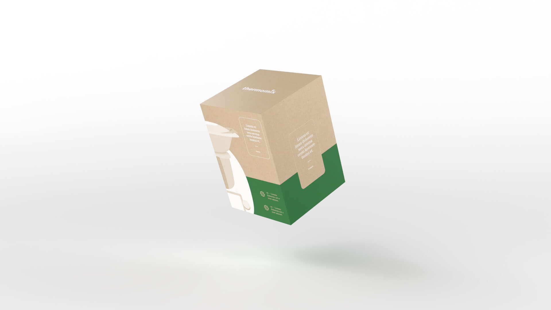
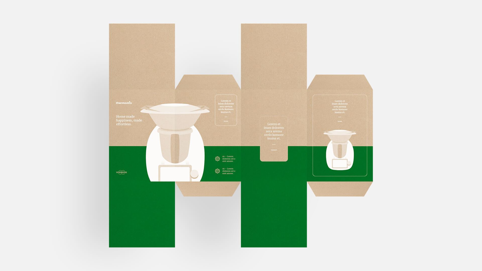
For this project, I developed a packaging concept for Thermomix that combines form and function in a clever way. The key idea: when multiple packages are placed side by side, they come together to complete the iconic image of the Thermomix. The result is a striking visual effect at the point of sale that grabs attention and reinforces brand identity.
For the launch of the new Thermomix TM6, the packaging was also given a modern and simpler visual identity. The packaging is characterized by its clear lines, design elements and clarity. The product illustration shows the product in an illustrated style. The design, which goes beyond the edge of the packaging, has a background. If you place two packages with the right side next to each other, you get a complete Thermomix. This makes a nice picture especially on store shelves.
AGENCY
House of Communication
TASKS
Packaging Design & Concept
Portfolio from Philipp Mandler
Philipp Mandler
Portfolio von Philipp Mandler
Based in Munich
Philipp Mandler
Portfolio von Philipp Mandler
Contact
Philipp Mandler
Portfolio von Philipp Mandler
© All rights reserved, 2025
Behance – Instagram - Ello
Behance – Instagram - Ello
Behance – Instagram - Ello


