Einfach sein ...
A farm at 950m above sea level, as a retreat for "endurance runners". The large fields, old, tall trees all around, far behind the rugged rocks from the large mountain ranges of the Salzburger Land, the colorful flower meadow, which is under nature protection and in which rare plants and animals have their home - and in the middle of it all a farmhouse as a vacation home at the Großschlaggut.
A farm at 950m above sea level, as a retreat for "endurance runners". The large fields, old, tall trees all around, far behind the rugged rocks from the large mountain ranges of the Salzburger Land, the colorful flower meadow, which is under nature protection and in which rare plants and animals have their home - and in the middle of it all a farmhouse as a vacation home at the Großschlaggut.
The estate, with roots tracing back to the year 1800, lies nestled in nature, telling its own quiet story—one of continuity, simple joys, and a strong sense of community. The challenge was to capture these values within the design itself.
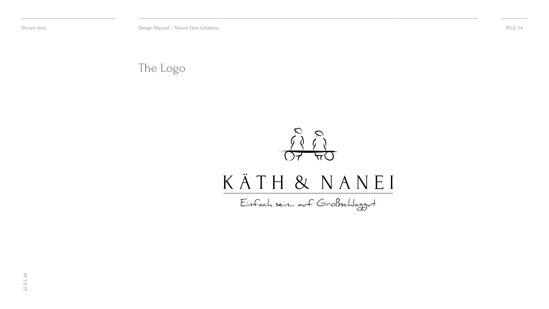
The starting point was the creation of a logo that would reflect the atmosphere of the place: two elderly women, seen from behind, sitting together on a small bench. A bench that once stood near the house, where the two would meet time and again. They talk, perhaps laugh softly, share memories—Käth und Nanei, just as one might imagine them. This stylized scene became the central visual element of the logo—minimalist, charming, and with a touch of nostalgia.
AGENCY
Philipp Mandler
TASKS
Creative Concept, Corporate Design, Logodesign, Webdesign

001
Concept & Inspiration
The chosen slogan „Einfach sein …“ accompanies the corporate design like a gentle, yet powerful undertone. It invites visitors to slow down, to appreciate the essence of life, and to experience a place where one can simply exist—without rush, without noise, in harmony with the surroundings.
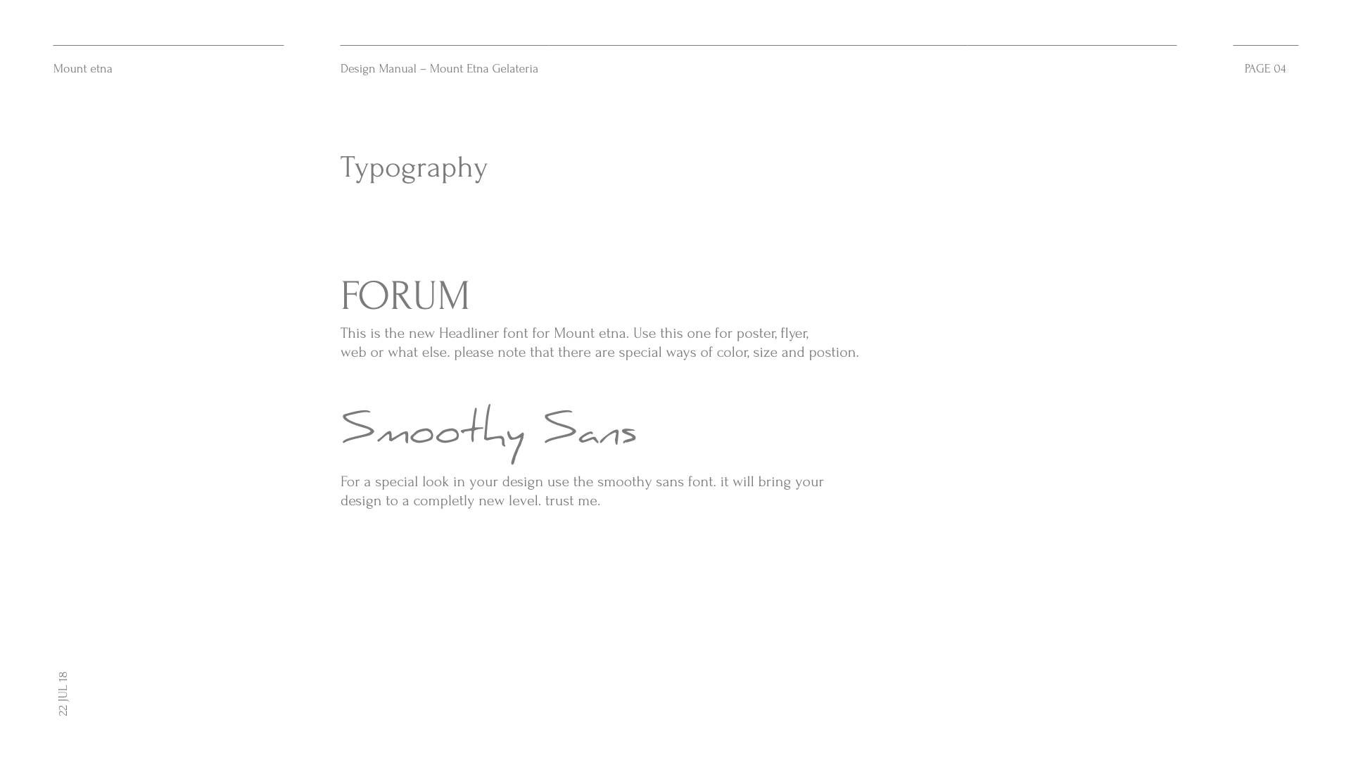
The color palette draws on natural hues: warm earth and wood tones, muted greens, and off-whites. The typography blends traditional forms with a subtle modern twist—elegant, grounded, timeless. Everything feels cohesive, as if the design had always belonged to this place.
Käth und Nanei is more than just a house. It’s a feeling. And that feeling has been brought to life through the corporate design.
002
Packaging
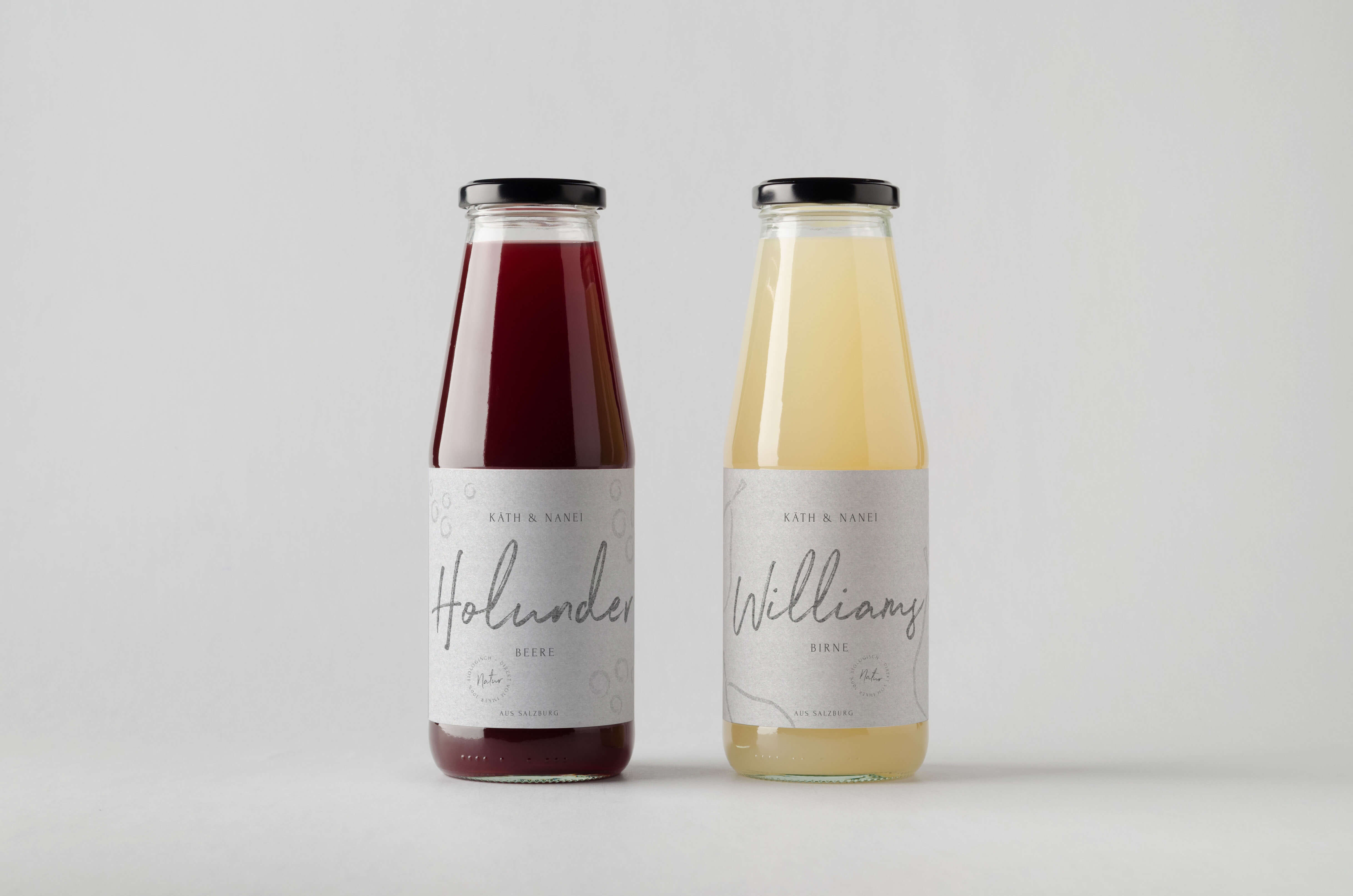
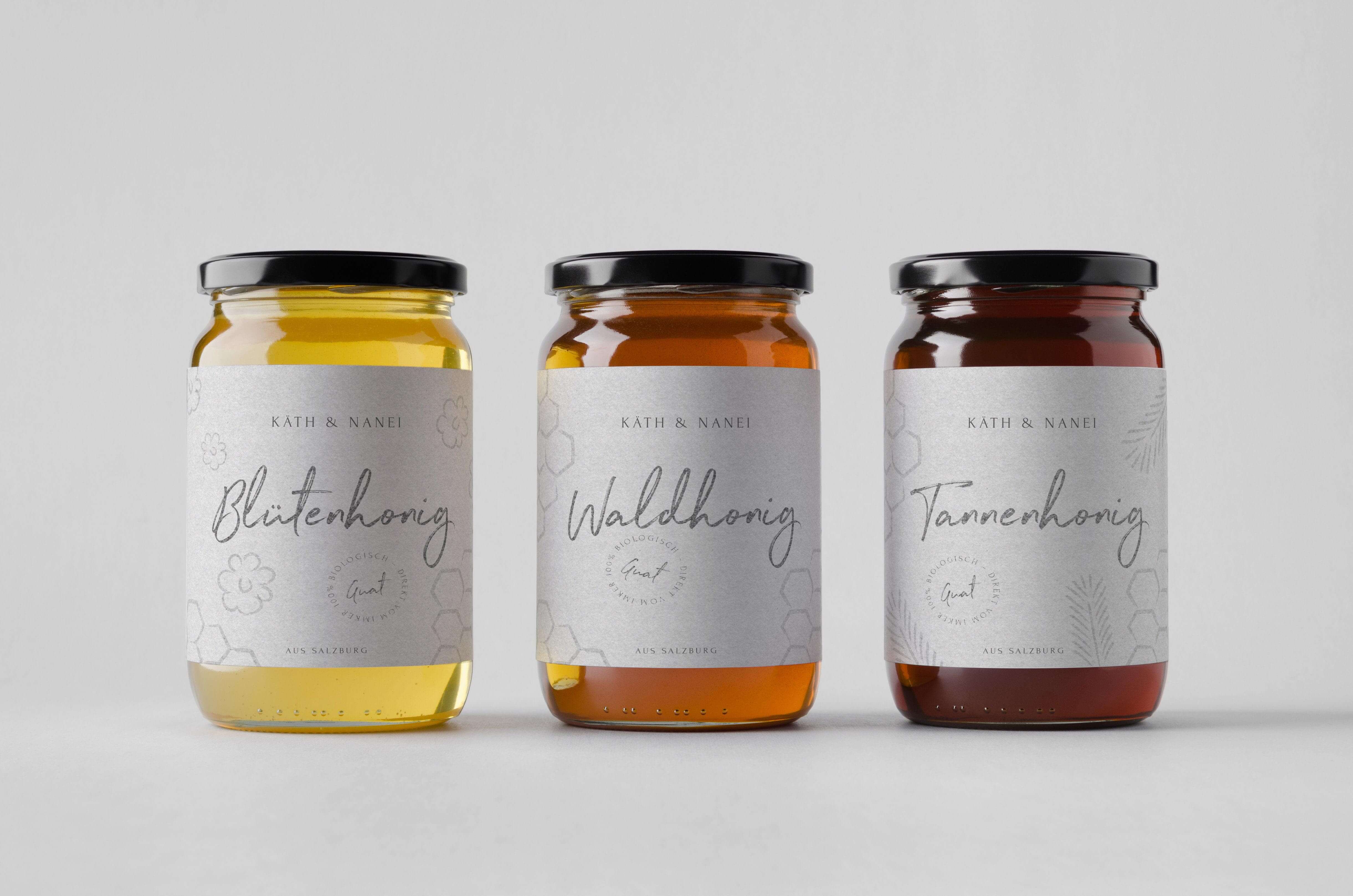
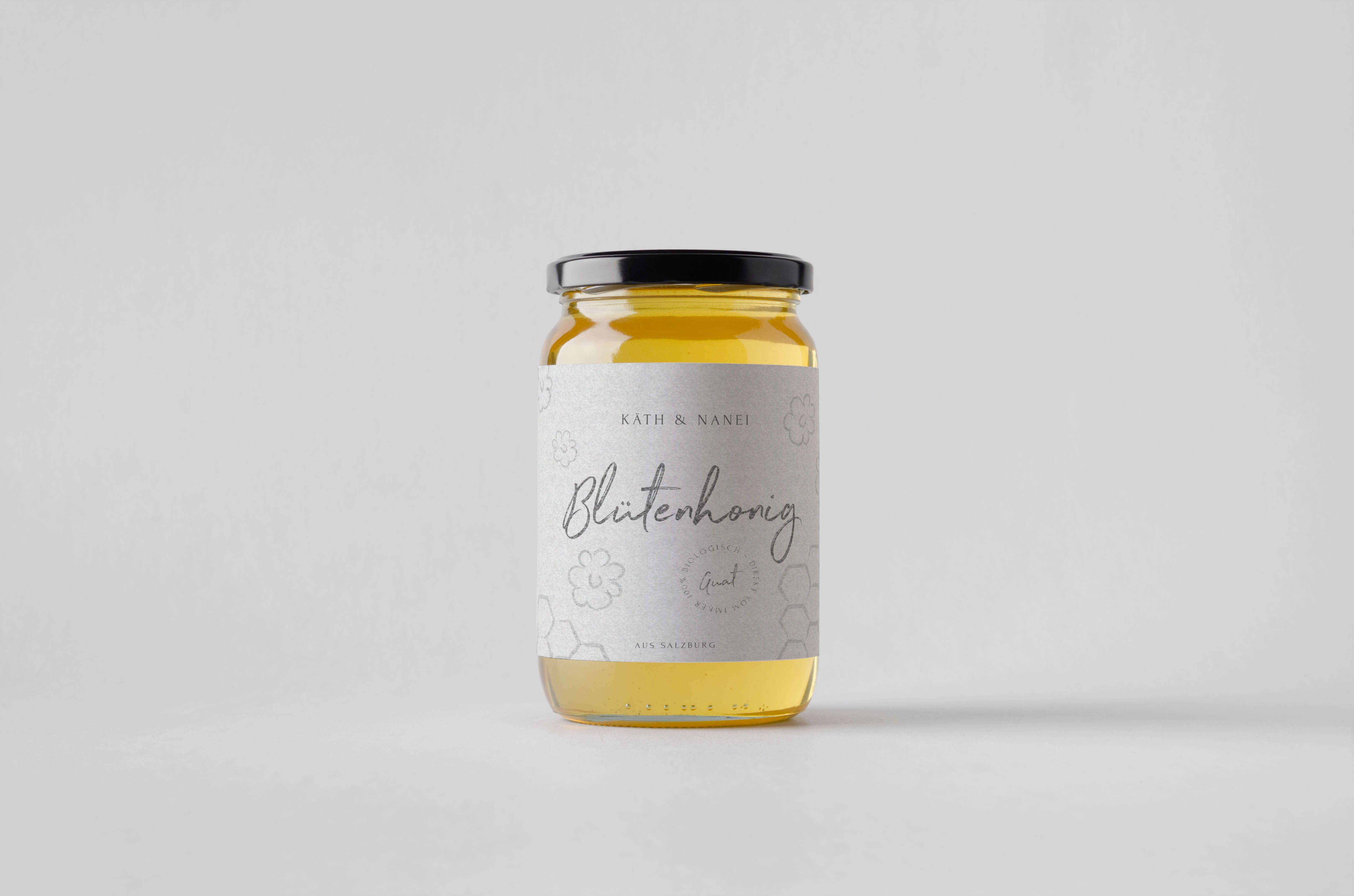
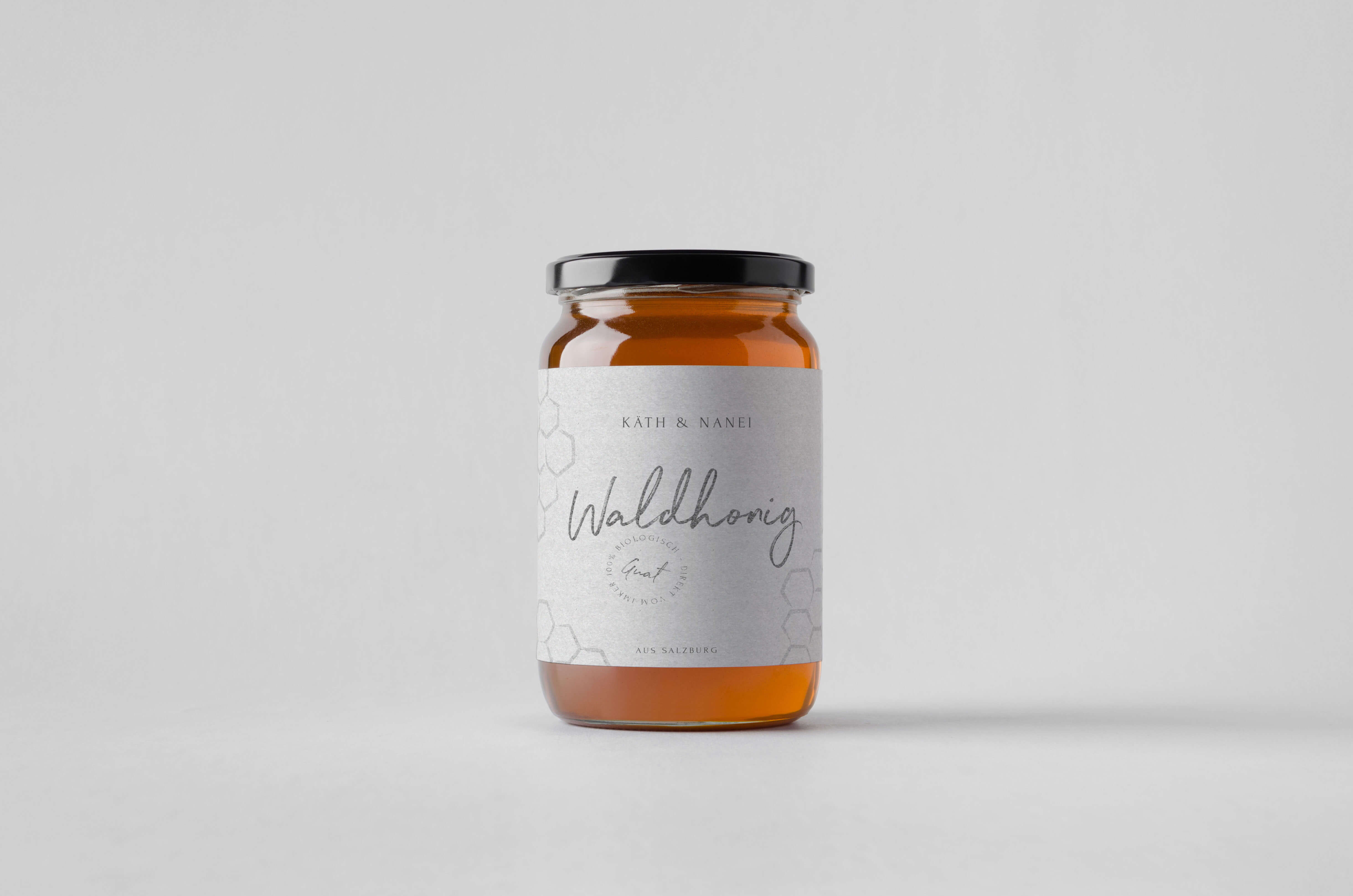
The packaging design for the house-made products reflects the values of „Einfach sein …“ with the same quiet sensitivity. Clean lines, natural materials like recycled paper or linen ribbon, and a minimalist layout highlight the authenticity and simplicity of the brand. Each package feels like a gentle invitation to slow down and savor the moment. Subtle, hand-drawn illustrations echo the connection to the region—featuring local elements such as the bench beneath the linden tree or native plants from the surrounding landscape. No loud typography, no flashy colors—just honest design for honest products. In this way, the packaging becomes more than just a wrapper; it is a quiet ambassador of the spirit behind Käth und Nanei.

003
Webdesign
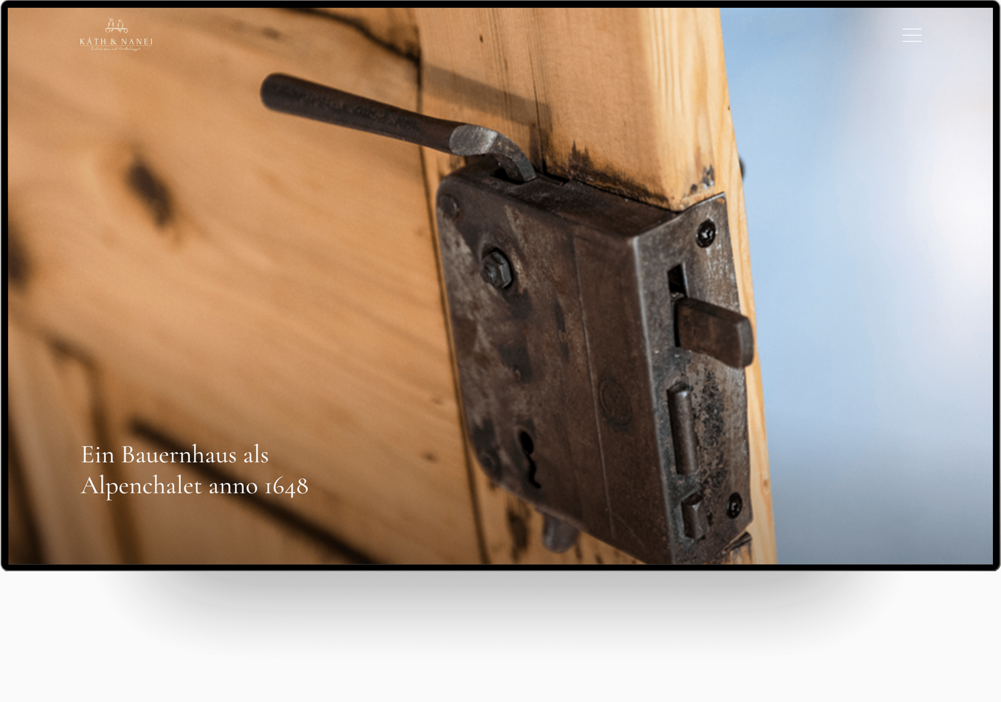
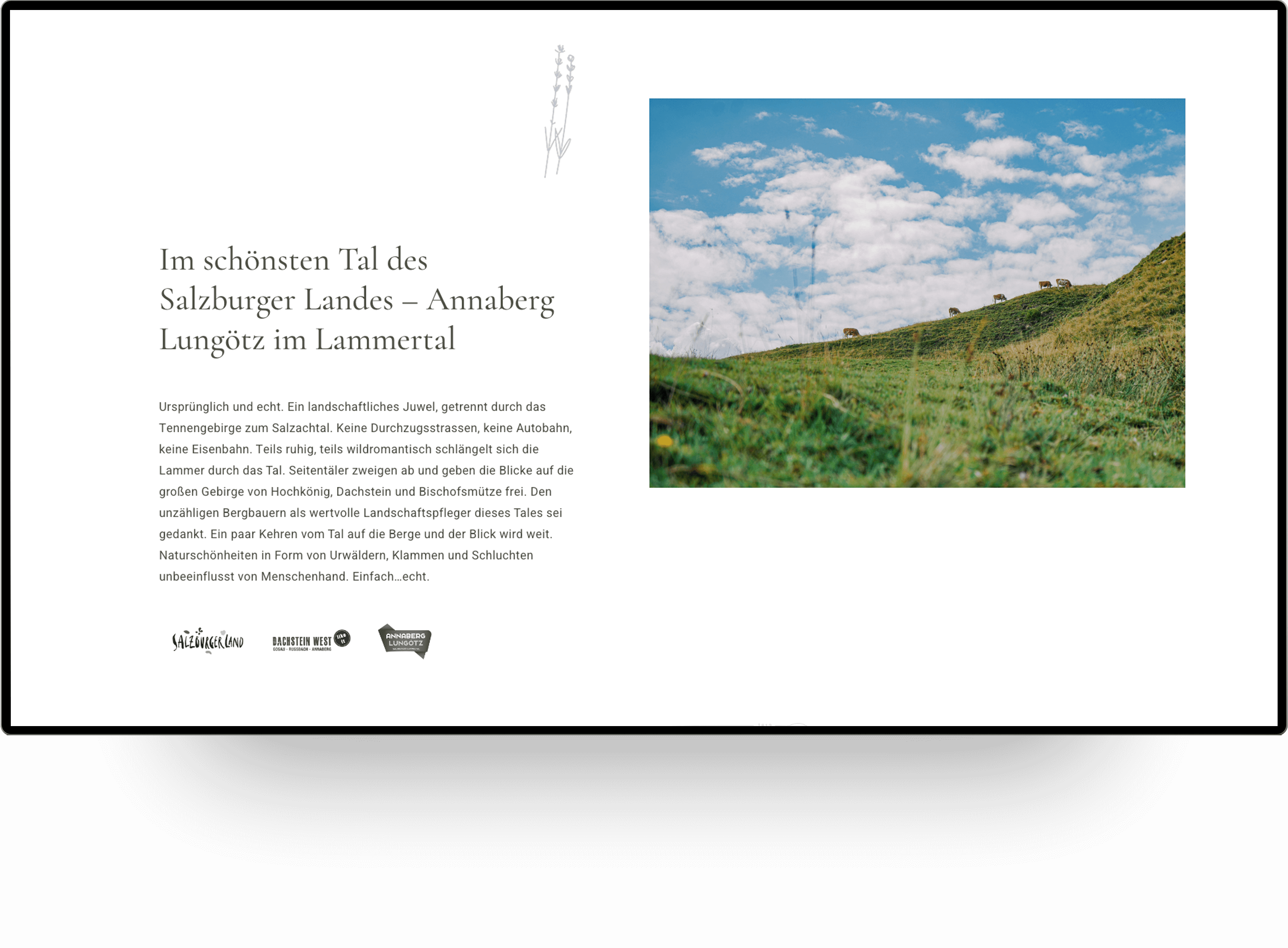
Already at the beginning of this project it was clear to me that the web presence of the house must be something special. After all, it is all about conveying to people that there is nothing around. The message that has to be transported was freedom.
Therefore I worked with a lot of white space and discreet elements, such as the vertical grey stripes. To present the house in the best possible way, I installed fullscreen containers.
Portfolio from Philipp Mandler
Philipp Mandler
Portfolio von Philipp Mandler
Based in Munich
Philipp Mandler
Portfolio von Philipp Mandler
Contact
Philipp Mandler
Portfolio von Philipp Mandler
© All rights reserved, 2025
Behance – Instagram - Ello
Behance – Instagram - Ello
Behance – Instagram - Ello
